Jun 2022

App design is more than pretty colors and flashy animation—it’s the how and why of the app development process, deeply ingrained throughout the entire project. UI/UX designers work to create both a well-designed user experience and a beautiful interface. UI/UX designers and software developers work together to deliver your concept into a full-fledged, go-to-market digital product so your app is ready for launch.
Developing code can seem like a concrete step, but how do you get your app’s design from concept to code? In this article, we’ll detail what you’ll need to do to transform ideas into user experiences, inject design theory and best practices, and deliver an app to market that delights the end user and meets your product goals.
At its core, app design is about defining strategy, reviewing designs with increasing detail and interactivity, and working with experts who immerse themselves in your project—aligning your goals and the product’s user experience at every stage. Designers apply elements such as color, navigation, and brand design, through a proven process that makes it easy for you to achieve your goals:
Read on for more details on each stage and how app design brings your ideas to fruition.
The strategy provides the plan to meet the business objectives of your app through design. Understanding your business, goals, and the desired end product is our very first objective and what guides our success, so our designers immerse ourselves in these areas. In discovery sessions, we work with you to identify your product vision and objectives. Through detailed research, discussion, and strategic analysis, we begin to define and visualize the end product.
Defining user experience requirements takes precedence from the very beginning of the app design process. To create the best design for your app, our designers work to fully understand what the end-to-end user experience should look like. To do this, we ask questions like these:
We also research the competitive landscape to unearth how your app is situated in the market during this stage. And, through audience analysis, we research the goals of potential users in that context.
Using information gathered from discovery sessions, competitor and audience analysis, and other relevant research, we are ready to start designing wireframes to validate the app’s information architecture and user flows, as discussed in the next stage.
The term “wireframe” has a long history, originating from design in car modeling, stop-motion animation, and sculpture to then being referenced in computer-aided design and CGI animation. Similarly, the wireframe serves as a visual guide to the user journey in app design, illustrating how your app will work.
Why is wireframing important? Think about it this way: If you were building a house, you wouldn’t want to invest time and money before understanding the blueprint. In the same way, a wireframe makes sense to design early in the process before investing time, money, and coding into the final product.
Fidelity is another essential aspect of the design process. Like the term “wireframe,” the term “fidelity” is drawn from other historical uses—in this case, the music scene, where it refers to audio quality. With wireframes in app design, fidelity represents the amount of detail shown. As we design your app, there is a spectrum of detail that begins to take more and more shape in terms of the level of clarity and interactivity.
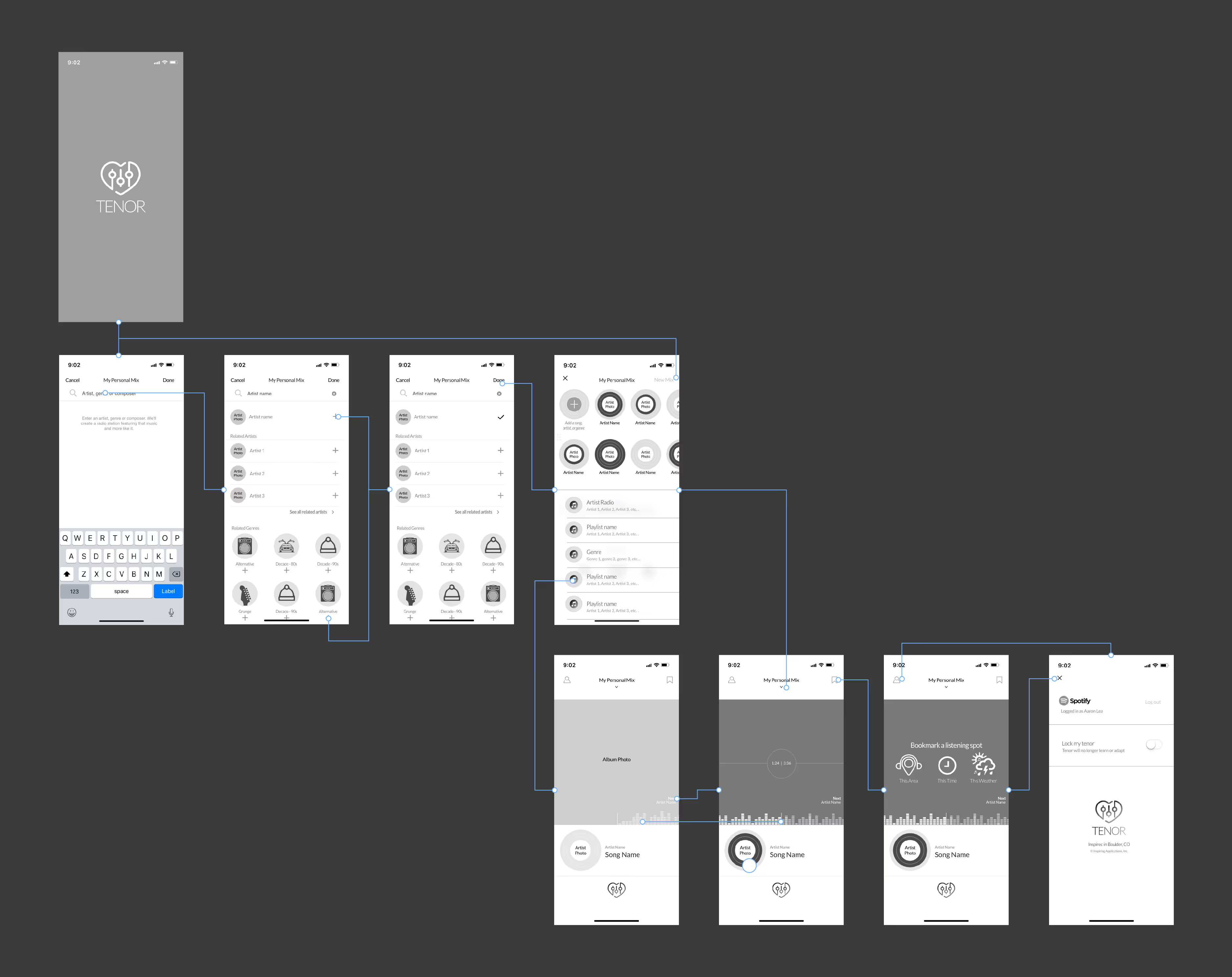
We develop sketches and low-fidelity wireframes, which we will typically share with clients. These wireframes validate the app’s information architecture and user flows before getting into actual designs.
For example, here’s a low-fidelity wireframe of a music app we developed:

Clients review the low-fidelity wireframes, and we learn what high-level changes need to be made before moving to the next stage—high-fidelity wireframing. We then begin to consider UI elements—the color palette, visual hierarchy, and more that will start to come to life in your app design.
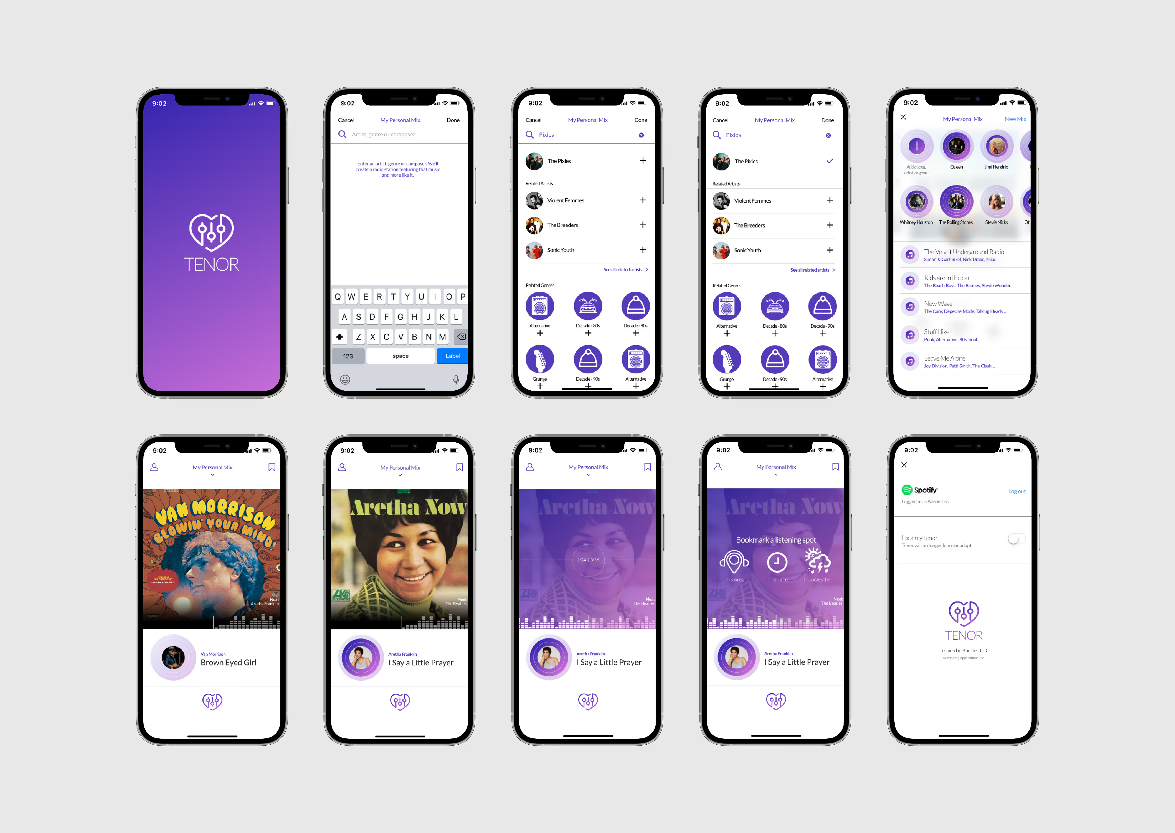
High-fidelity designs are an effective preview of your app, rendering details in full color. At this stage, we take the wireframes and bring them to life with a fully branded design.
Using the same app as above as an illustration, you can see the difference as we’ve moved from low-fidelity to high-fidelity:

High-fidelity designs and, when needed, working prototypes, offer many advantages as the last step on the design detail spectrum. They provide an immersive experience that helps everyone truly grasp your app and provide a refined level of feedback to establish final agreement before coding begins. Seeing details in full color alongside architecture and flow, we can also improve the user experience.
Here’s a summary of the purpose these high-fidelity designs serve:
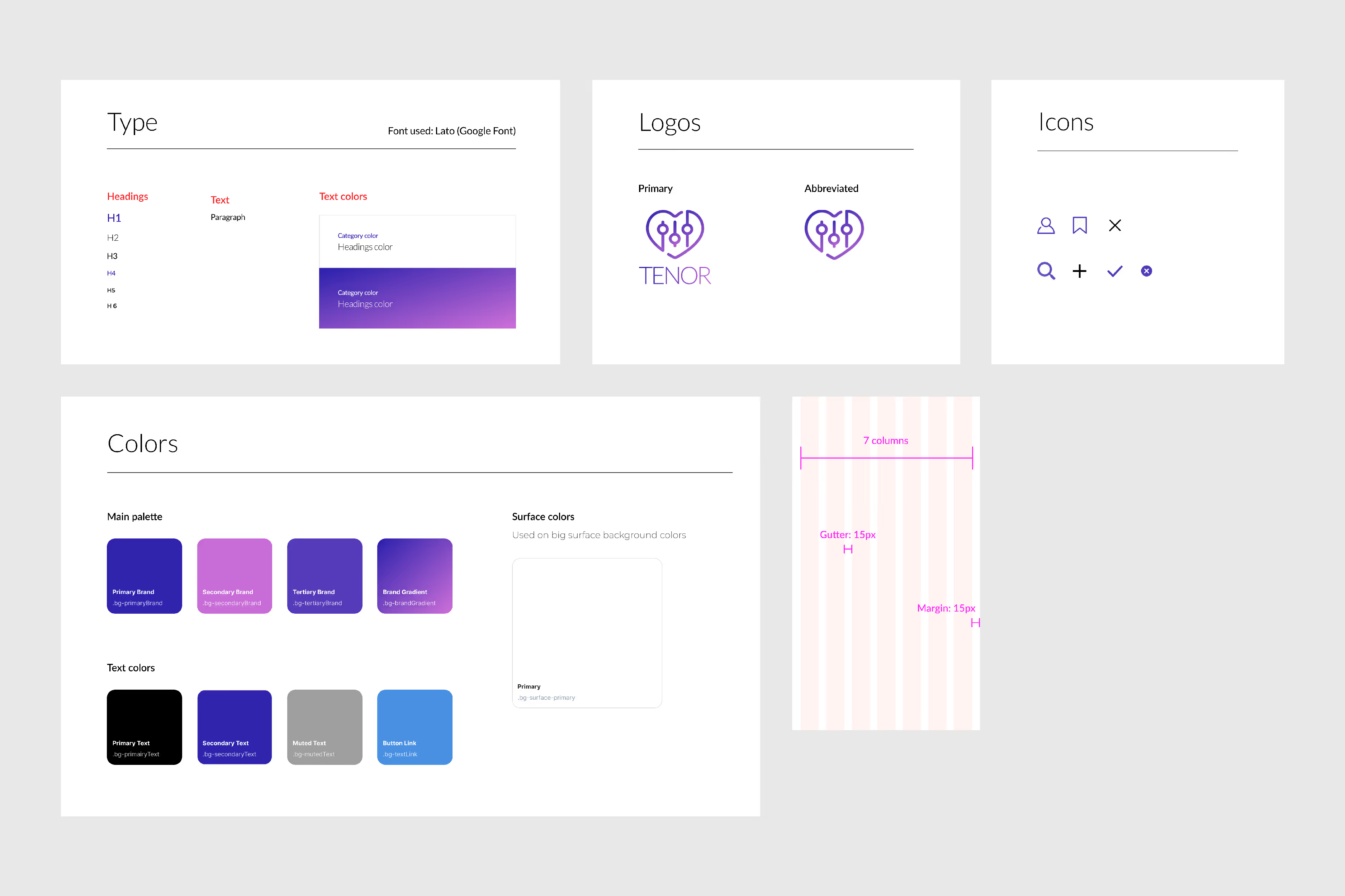
After a few rounds of revisions, we’ll create a digital style guide that we will hand off to developers who will build the app.
For example, here are some snapshots from the style guide for the music app:

To download or not to download—that is the question. And with so many choices, delivering code isn’t enough to make a digital product successful. You want your app to be seen, which makes the launch and marketing stage equally crucial to all the others from a designer’s point of view. You can go beyond making a great first impression by marketing your app to attract, engage, and exceed your users’ expectations.
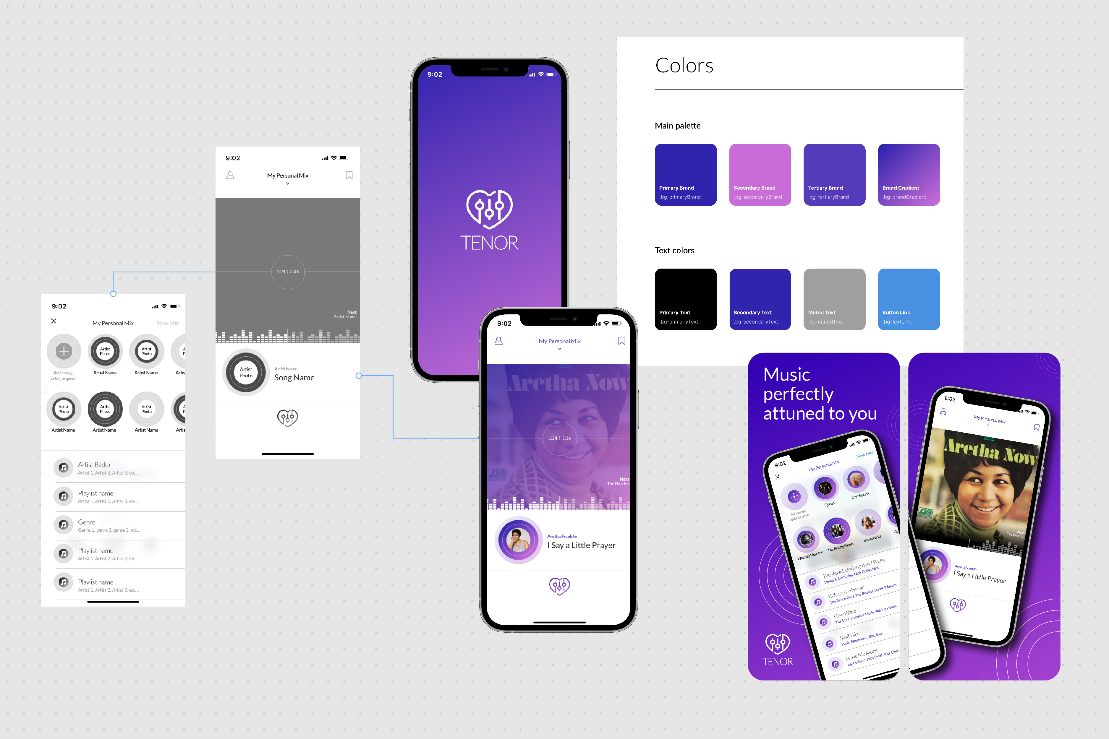
While the strategies for marketing your app may vary, selling your app visually is a vital component of marketing it. App store landing pages feature your icon, screenshots, and video previews.
The landing pages for our music app, for example, appeal to potential users by providing an attractive and informative visual summary of the app’s design and key features:

Building a successful digital product requires more than development skills—design is a crucial consideration for any app project. At InspiringApps, our design skills elevate us from what other development agencies can provide. According to InspiringApps’ Art Director, Aaron Lea, what we’re creating is inspired and unique:
Central to our app design methodology is our finish line, every time guarantee. InspiringApps pours our expertise into your app design and development from start to launch. As evidenced by our award-winning apps and our design-centric team, our app design process is integral to bringing your app to market. We guarantee your project will reach the finish line.
Passionate. Determined. Crazy talented, yet humble. All words that describe the mix of people that make up the team at InspiringApps. We’re an inclusive group of employees who care deeply about what we do. Our team is the not-so-hidden treasure behind our success.
Learn more about us