Dec 2021

Editor’s Note:
The conversation around AI is moving incredibly fast, and as a team dedicated to building products that people love and trust, this is a topic we discuss often. We believe the principles of ethical, human-centered design are more critical than ever. This is our updated take on dark UX for product leaders and teams. We hope it helps you build better, more trustworthy products.
In 2025, the boundary between helpful design and harmful manipulation has become increasingly subtle. With AI shaping interfaces in real time and personalization driving key interactions, even well-intended choices can have unintended consequences.
At InspiringApps, we rarely use the term “dark UX” internally, but we care deeply about what it represents: design patterns that undermine user agency while appearing seamless or optimized. This post explores how those patterns show up in today’s products, how they’re evolving in the AI era, and what ethical, human-centered design looks like in practice.
Dark UX patterns are interface designs that steer users toward decisions they might not make on their own. Often, they rely on behaviorally informed tactics to increase signups, capture data, or nudge conversions, not through clarity, but through confusion or pressure.
These patterns often borrow the language and structure of good UX. That’s what makes them effective. They’re backed by research, designed to minimize friction, and tested for performance. But the outcome serves business objectives more than user needs. They’re not accidents. They’re the result of decisions.
And that’s the ethical tension: design can support or subvert user choice, depending on how that research is applied.
Dark patterns range from the “Roach Motel,” where it is easy to get into a certain situation, but hard to get out of it, to “Disguised Ads,” where adverts are disguised as other types of content or navigation in order to prompt you to click on them. (Think of that ad with the big “Download Now” button…)
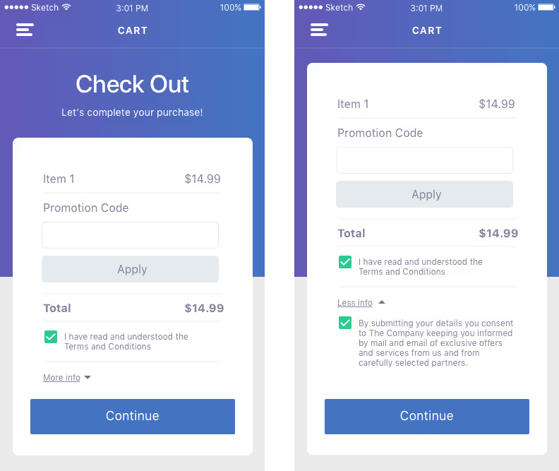
Many dark patterns are simple instances created to keep you subscribed, sold, or sharing your data. In the example below, what seems like a basic checkout experience hides a dark pattern. The company has chosen to hide pertinent information for the user within the “More info” tab. If expanded, the user will find that the product defaults to signing them up for both emails and mail from the company, as well as their “carefully selected partners.”
This is possible because the company understands user psychology and behavior and anticipates that many users will fail to expand the “More info” tab. The default selection will allow the company to accomplish its objective of signing users up for promotions while ignoring the fact that most users probably don’t want to start receiving these offers. A more straightforward and user-centered approach would be to leave this button unchecked and let the user opt in if they wished.
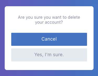
Often, dark design patterns are created through the interface design elements. Here, the user has clearly chosen to delete their account. While it is certainly good practice for the company to confirm this desire, this company is seeking to thwart the user’s intent by leveraging color to its advantage, a dark pattern often called “Misdirection.”
Typical user behavior for this interface dictates that a user is likely to tap the dominant, blue button with the assumption that it will complete the action they have started. By displaying “Cancel” on the blue button, the company reinforces its objective of keeping the user’s account intact, while ignoring the most likely objective of the user at this point.
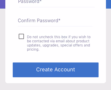
Dark UX patterns can also occur simply within the verbiage that an app uses. In the example below, you can see how the wording might be confusing to a user. Lengthy explanations, double negatives, and other wording tricks exploit the user’s likely behavior of skim reading or, at the very least, cause confusion that can result in an unwanted action. A straightforward “Sign me up to receive product updates, upgrades, special offers, and pricing” would be much more beneficial and clear to the user.
Many patterns have been in use for years. Some are so common they’re rarely questioned. These are familiar patterns, not fringe cases. While individually small, they compound into a user experience that feels less like a service and more like a funnel. They rely on users giving up, giving in, or not noticing.
AI is increasingly embedded in the logic of modern interfaces, not just powering the backend, but shaping the experience itself. While helpful and useful in many cases, it also makes manipulation easier to automate.
Furthermore, AI, by default, optimizes for the goal it’s given. If that goal is clicks, subscriptions, or purchases, the experience may start serving those outcomes more than the user. And when optimization becomes invisible (e.g., driven by algorithms that adjust without explanation) users lose clarity on what’s guiding their choices.
An opt-out link that changes tone based on a user’s hesitation. A discount offer triggered by emotional cues. A recommendation that appears urgent but is generated solely to increase engagement. These are emerging dark patterns in the AI era.
Internally, our team has seen firsthand what happens when AI is introduced without meaningful human oversight. We’ve tested interfaces where AI-generated suggestions created more confusion than clarity. We’ve had to actively mitigate AI outputs that, left unchecked, reinforced bias, injected irrelevant personalization, or subtly pressured users toward a business goal.
These are trust issues that, if left unresolved, lead to poor user experiences, damaged reputations, and potentially increasing regulatory scrutiny.
Design always influences behavior. That’s not inherently wrong. Guidance is part of usability. Reminders help users complete tasks. Recommendations surface relevant content.
The question is whether the influence supports the user’s goal or simply advances the business metric. A well-placed nudge can reduce friction, but a deceptive one removes real choice. The distinction isn’t always visible from the outside, but for product teams, it matters.
When a user’s hesitations are treated as opportunities to manipulate rather than understand, the ethical line has already been crossed.
At InspiringApps, we approach AI with a human-in-the-loop mindset. That means designers, not algorithms, are responsible for ensuring experiences are clear, inclusive, and respectful. We use AI to assist, not abdicate intent. The goal is meaningful engagement. Because in our view, a truly successful product is one that users want to return to, not one they regret using.
Dark patterns often get utilized for short-term gains, such as increasing the number of newsletter subscriptions or bumping revenue. While “the numbers” might look good for a brief time, we believe that great UX design that acts ethically on behalf of your user is ultimately good for your company and brand, too.
Thankfully, most reputable developers conduct user experience research for the consumer’s good. How? From the very start, they approach the project with a user-centric perspective. At InspiringApps, for example, you will often hear our team ask questions like:
User-oriented questions like these lay the groundwork for the app’s user flow, user personas, use case scenarios, and technical requirements.
Design decisions will be made anticipating a user’s most likely objectives as well as their most likely behavioral patterns, resulting in a great user experience that will allow the user to navigate smoothly and intuitively through the app. Consideration is given to each part of the app throughout the process, whether it be the initial navigational planning, the interface elements, or the verbiage and tone used throughout the product.
The risk is no longer just reputational. It’s financial. Companies that rely on manipulative UX now face fines, investigations, and increased public scrutiny.
The FTC and international consumer protection networks recently found that 76% of subscription services they examined used at least one potential dark pattern (FTC). California’s privacy regulations now explicitly address dark patterns in consent flows, and the EU’s Digital Services Act has introduced broader accountability for deceptive or coercive interfaces (Tech Policy Press).
Is your product building or eroding trust? Ask your team:
Dark patterns are rarely the result of one big unethical choice. They’re often the byproduct of small decisions made under pressure, decisions that prioritize short-term metrics over long-term relationships. But the cost of leaving them in place is growing: diminished trust, frustrated users, and increased regulatory exposure.
In 2025, the most successful digital products aren’t the ones that convert the fastest. They’re the ones that create a relationship worth continuing.
Whether through design audits, workshops, or implementation guidance—let’s start a conversation.
Embark on your app development journey armed with our free, detailed security checklist. This invaluable resource ensures that alongside beauty and functionality, your app embodies robust security across crucial areas. Apply industry-standard encryption, secure payment gateways, manage and monitor logs, and ensure regulatory compliance.
Download the free app security checklistWe help brands thrive in the digital world.
Inspired Where We Are—Our team of experts is 100% US-based, delivering user-inspired digital products from Boulder and beyond.